Raster vs Vector: The Hidden Battle Shaping Digital Design
The debate over raster vs vector isn’t just about pixels versus paths—it’s the foundation of how digital and physical media are created, scaled, and distributed. One dominates billboards and logos; the other thrives in photography and web interfaces. The wrong choice can turn a crisp logo into a pixelated mess or force designers to rework entire projects. Yet, despite its ubiquity, the distinction remains misunderstood, often reduced to vague terms like "high-res" or "scalable." The reality is far more nuanced: raster vs vector dictates everything from print quality to file size, from screen rendering to animation fluidity.
What separates these two graphic paradigms isn’t just technical—it’s philosophical. Raster images, with their grid of colored squares, are the descendants of early digital photography and scanning technology. They excel in capturing realism but falter when stretched beyond their native dimensions. Vector graphics, by contrast, rely on mathematical precision, defining shapes through coordinates and curves. This makes them ideal for logos, icons, and illustrations that must retain sharpness at any size. The tension between the two isn’t just about capability; it’s about workflow efficiency, file management, and even ethical considerations in digital reproduction.
The stakes are higher than ever. With the rise of high-DPI displays, responsive web design, and AI-generated assets, the raster vs vector divide influences everything from user experience to copyright enforcement. A poorly optimized raster image can slow down a website; a misapplied vector effect might distort a critical brand asset. Understanding these systems isn’t optional—it’s a prerequisite for anyone working in design, marketing, or digital media.

The Complete Overview of Raster vs Vector Graphics
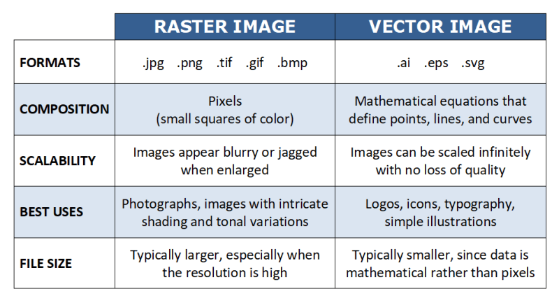
At its core, the raster vs vector distinction boils down to how data is structured and rendered. Raster graphics—commonly referred to as bitmap images—are composed of a fixed grid of pixels, each assigned a color value. This method is inherently tied to resolution: enlarge a raster image, and the pixels become visible, creating a jagged or blurry effect. Vector graphics, however, use geometric primitives (points, lines, curves) defined by mathematical equations. Scaling a vector file doesn’t degrade quality because the software recalculates the shape based on its original definitions. This fundamental difference explains why vectors dominate logo design while rasters rule in photography.The implications extend beyond aesthetics. Raster files (e.g., JPEG, PNG, GIF) are typically larger in file size for complex images due to their pixel-based nature, whereas vector files (e.g., SVG, AI, EPS) remain compact because they store instructions rather than visual data. This efficiency makes vectors ideal for logos, icons, and typography, where scalability is critical. Meanwhile, rasters excel in continuous-tone imagery—photographs, digital paintings, and textures—where the nuance of color gradients and textures is irreplaceable. The choice between them isn’t just about format; it’s about the intended use case, the tools available, and the technical constraints of the project.
Historical Background and Evolution
The origins of raster vs vector graphics trace back to the earliest days of computer imaging. Raster technology emerged in the 1950s with the development of digital scanning and early display systems, where images were represented as matrices of dots. This method mirrored traditional photography and was initially limited by hardware constraints—low resolutions and monochrome displays. By the 1980s, advancements in color depth and pixel density made raster graphics the standard for photographic and realistic imagery, cementing their role in digital cameras, web browsers, and consumer electronics.Vector graphics, meanwhile, evolved from the mathematical precision required in engineering and technical drawing. In the 1960s, systems like the IBM 2250 used vector-based displays for CAD (Computer-Aided Design) applications, where scalability and geometric accuracy were paramount. The introduction of PostScript in the 1980s by Adobe further popularized vector formats, enabling high-quality typography and illustration in printing. Today, the raster vs vector divide reflects this historical dichotomy: rasters for realism, vectors for precision.
Core Mechanisms: How It Works
Raster graphics operate on a simple yet rigid principle: a grid of pixels, each with a defined color. When displayed, the software interpolates between these pixels to create the illusion of smooth gradients and curves. The resolution of a raster image—measured in pixels per inch (PPI) or dots per inch (DPI)—determines its sharpness. Doubling the resolution quadruples the file size, as each pixel is duplicated or averaged to maintain detail. This is why high-resolution rasters are essential for print media, where physical dimensions require precise pixel density to avoid aliasing (the stair-step effect on curves).Table of Contents
- The Complete Overview of Raster vs Vector Graphics
- Historical Background and Evolution
- Core Mechanisms: How It Works
- Key Benefits and Crucial Impact
- Major Advantages
- Comparative Analysis
- Future Trends and Innovations
- Conclusion
- Comprehensive FAQs
- Q: Can raster images be converted to vector?
- Q: Why does a vector logo look pixelated when printed?
- Q: Are SVG files always better for the web?
- Q: How does DPI/PPI affect raster vs vector files?
- Q: What’s the best format for sharing graphics between designers and clients?
- Q: Can AI tools bridge the gap between raster and vector?
Vector graphics, in contrast, rely on a system of anchor points, paths, and fill rules. A vector shape is defined by a series of coordinates that describe its outline, with additional data specifying fills, strokes, and gradients. When scaled, the software recalculates these coordinates to fit the new dimensions, ensuring crisp edges and smooth curves. This method is computationally efficient for geometric shapes but becomes cumbersome for complex, organic forms—hence the hybrid approach seen in modern design tools, where vectors handle logos and icons while rasters manage textures and photographs.
Key Benefits and Crucial Impact
The raster vs vector choice isn’t merely technical—it’s strategic. Raster images dominate fields where visual fidelity and color accuracy are non-negotiable, such as photography, medical imaging, and digital art. Their ability to capture subtle tonal variations and textures makes them indispensable for realistic representations. However, their resolution dependency introduces challenges in scaling, requiring designers to work with multiple versions of the same image (e.g., 72 PPI for web, 300 PPI for print). Vector graphics, meanwhile, thrive in environments where scalability and editability are priorities, from brand identities to animated interfaces.The impact of this divide extends to industries beyond design. In printing, for instance, vectors ensure that logos and illustrations remain sharp across business cards, billboards, and packaging. In digital media, rasters power everything from social media thumbnails to high-end video production. The rise of hybrid workflows—where designers combine vectors for logos and rasters for backgrounds—reflects the complementary nature of these systems. Yet, the tension persists: misapplying a raster where a vector is needed (or vice versa) can lead to costly rework or compromised quality.
"The choice between raster and vector isn’t about superiority—it’s about solving the right problem with the right tool. A photograph will never be a vector, and a logo will never be a raster without losing its essence." — Erik Spiekermann, Typeface Designer
Major Advantages
-
Raster Graphics:
- Unmatched realism for photographic and textured imagery.
- Widely supported across all digital platforms and devices.
- Ideal for complex color gradients and dithering effects.
- Smaller file sizes for simple images (e.g., icons with flat colors).
- Direct compatibility with cameras, scanners, and real-world visual data.
-
Vector Graphics:
- Infinite scalability without quality loss.
- Compact file sizes for geometric and typographic assets.
- Full editability—shapes, colors, and paths can be modified non-destructively.
- Superior performance in animations and interactive interfaces.
- Universal compatibility in print and digital media when exported correctly.

Comparative Analysis
| Criteria | Raster Graphics | Vector Graphics |
|---|---|---|
| Data Structure | Pixel grid (fixed resolution) | Mathematical paths (scalable) |
| Best Use Cases | Photography, digital art, textures, web images | Logos, icons, typography, illustrations, animations |
| File Size | Large for high-resolution images | Small for simple shapes; grows with complexity |
| Scalability | Degrades when enlarged (pixelation) | Infinite scaling without quality loss |
| Editing Flexibility | Limited to pixel manipulation (e.g., Photoshop) | Full control over shapes and paths (e.g., Illustrator) |
Future Trends and Innovations
The raster vs vector landscape is evolving with advancements in AI and hybrid imaging techniques. Machine learning is increasingly used to enhance raster images—upscaling low-resolution photos or converting vectors to rasters with photorealistic textures. Meanwhile, vector-based workflows are expanding into new territories, such as 3D modeling and dynamic typography, where mathematical precision is critical. The rise of SVG (Scalable Vector Graphics) in web design reflects this shift, as vectors gain traction for responsive interfaces and interactive graphics.Looking ahead, the convergence of these formats may blur traditional lines. Tools like Adobe’s "Live Shapes" and AI-assisted vectorization suggest a future where designers can seamlessly switch between raster and vector representations. Additionally, the growth of high-resolution displays (4K, 8K) and virtual reality demands optimized assets that leverage the strengths of both paradigms. The raster vs vector debate may soon be less about choice and more about integration—where the best solutions combine the strengths of each to meet the demands of next-generation media.
Conclusion
The raster vs vector distinction remains one of the most fundamental concepts in digital design, yet its implications are often overlooked in favor of surface-level discussions about "high quality" or "low resolution." Understanding these systems isn’t just about technical proficiency—it’s about making informed decisions that align with creative goals, technical constraints, and industry standards. Whether you’re designing a logo, optimizing a website, or preparing an asset for print, the choice between raster and vector will shape the outcome.As digital media continues to evolve, the ability to navigate this divide will be a defining skill. The future may bring more seamless integration between the two, but the core principles—precision vs. realism, scalability vs. detail—will endure. For designers, developers, and creators, mastering raster vs vector isn’t just about keeping up; it’s about leading the way in how visual information is created, shared, and experienced.
Comprehensive FAQs
Q: Can raster images be converted to vector?
A: Yes, but the process—called "vectorization"—is complex and often requires manual refinement. Automatic tools (like Adobe Image Trace) convert raster outlines to paths, but intricate details (e.g., hair, textures) may lose fidelity. For best results, start with high-contrast, high-resolution rasters or use hybrid workflows where vectors handle the core shapes and rasters provide textures.
Q: Why does a vector logo look pixelated when printed?
A: This typically happens due to incorrect file export settings. Ensure the vector file is saved as a high-resolution format (e.g., EPS, PDF/X-1a) and that the printer’s RIP (Raster Image Processor) is configured to handle vector data properly. Low-resolution PDFs or embedded raster previews can also cause degradation. Always verify the output intent (e.g., CMYK for print) and resolution settings.
Q: Are SVG files always better for the web?
A: Not necessarily. While SVGs offer scalability and smaller file sizes for simple graphics, they can become unwieldy for complex images with gradients, filters, or embedded rasters. For photographic content or detailed illustrations, optimized PNGs or WebPs often perform better in terms of load times and compatibility. Test both formats using tools like Google’s PageSpeed Insights to determine the best option for your specific use case.
Q: How does DPI/PPI affect raster vs vector files?
A: DPI (dots per inch) and PPI (pixels per inch) primarily apply to raster images, dictating their physical print size and sharpness. Vectors are resolution-independent, meaning they ignore DPI/PPI settings—they scale perfectly regardless. However, when exporting vectors for print, specify a high DPI (e.g., 300) in the document settings to ensure the printer interprets the file correctly. For rasters, always match the DPI to the intended output (e.g., 72 PPI for web, 300 PPI for print).
Q: What’s the best format for sharing graphics between designers and clients?
A: For logos and illustrations, use SVG or AI/PDF to preserve vector quality. For photographic or complex raster assets, provide high-resolution PNGs or TIFFs (uncompressed). Avoid JPEGs for editable work due to lossy compression. If collaboration involves multiple file types, include a style guide specifying resolution requirements, color modes (RGB vs. CMYK), and intended use (digital vs. print).
Q: Can AI tools bridge the gap between raster and vector?
A: Emerging AI tools are making strides in this area. For example, Adobe’s "Generative Fill" can create vector-like masks from raster selections, while MidJourney or DALL·E can generate high-resolution rasters that can later be vectorized. However, AI-assisted vectorization still requires human oversight to maintain accuracy, especially for intricate designs. The future may see more automated hybrid workflows, but for now, manual refinement remains essential for professional results.
Leave a Comment
Comments are moderated before appearing. The data you submit is processed according to the Privacy Policy of Bevvy.