A Colorful Journey Through Time: The History of the Google Logo
The history of the Google logo is a fascinating chronicle of evolution, innovation, and the power of branding. From its humble beginnings as a Stanford University research project to its current status as a global tech giant, Google’s logo has undergone several transformations, each reflecting the company’s growth and the changing landscape of the internet. This article will delve into the fascinating history of the Google logo, exploring its various iterations and the stories behind them.
The Early Days: Stanford and BackRub (1996-1998)
Before Google even existed as a company, it was a research project called BackRub, conceived by Larry Page and Sergey Brin at Stanford University. The initial logo, if it could even be called that, was a simple text-based graphic featuring the word “BackRub” in a rather rudimentary font. This logo was far from polished, reflecting the academic and experimental nature of the project at the time. It served its purpose, identifying the search engine, but lacked the design sophistication that would later become synonymous with the Google brand. The history of the Google logo truly begins here, with this humble mark.
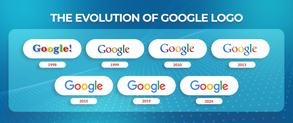
The First Google Logo: A Graduate Student’s Creation (1998)
In 1998, Google officially came into being. To mark this milestone, Sergey Brin, who had some graphic design experience, created the first official Google logo using GIMP, a free image editing software. This logo featured the word “Google” in a font based on the Block Letters typeface. The colors were chosen somewhat arbitrarily, but the arrangement – blue, green, red, yellow – would become a recurring theme in Google’s visual identity. An exclamation point was also added, mimicking the Yahoo! logo, which was a dominant force on the internet at the time. While not particularly refined, this logo represented a significant step forward from the BackRub days, signaling the birth of a new player in the search engine market. This early version is a key part of the history of the Google logo.
Ruth Kedar’s Redesign: A More Polished Look (1999-2010)
As Google gained traction, it recognized the need for a more professional and memorable logo. In 1999, Larry Page and Sergey Brin enlisted the help of Ruth Kedar, a Stanford art professor, to redesign the logo. Kedar explored a wide range of design options, experimenting with different fonts, color palettes, and layouts. The final design, which would remain in use for over a decade, featured the Catull typeface, a serif font that conveyed a sense of authority and trustworthiness. The color sequence was retained, but the exclamation point was removed, giving the logo a cleaner and more sophisticated appearance. A subtle shadow effect added depth and dimension. This redesign was a crucial chapter in the history of the Google logo, establishing a visual identity that resonated with users worldwide.
Subtle Refinements: The 2010-2013 Iteration
In 2010, Google introduced a subtle refinement to the Kedar-designed logo. The shadow effect was flattened, and the colors were slightly adjusted to be brighter and more vibrant. While the changes were minor, they reflected Google’s ongoing commitment to visual clarity and a more modern aesthetic. This iteration demonstrated that the history of the Google logo is not just about radical changes but also about continuous improvement and optimization.
The Flat Design Era: 2013-2015
The rise of flat design, a minimalist aesthetic that emphasizes simplicity and usability, influenced Google’s logo once again in 2013. The shadow effect was completely removed, resulting in a completely flat design. The colors were also slightly tweaked. This change aligned the Google logo with the prevailing design trends and reflected the company’s focus on a seamless user experience across all devices. This transition to a flat design is another significant milestone in the history of the Google logo.
The Modern Google Logo: A New Font and a Fresh Perspective (2015-Present)
In 2015, Google unveiled its most significant logo redesign to date. The iconic Catull typeface was replaced with a custom-designed geometric sans-serif font called Product Sans. This new font was designed to be more legible and adaptable across different platforms and screen sizes. The colors were also slightly adjusted to be more vibrant and consistent. This redesign marked a departure from the traditional serif font and signaled Google’s evolution into a more modern and versatile company. The new logo also came with a suite of related visual elements, including a colorful “G” icon and a set of animated dots, which are used to represent Google in various contexts. This current version is a culmination of the history of the Google logo, reflecting the company’s present identity and future aspirations.
The Google Doodle: A Celebration of Creativity
No discussion of the history of the Google logo would be complete without mentioning the Google Doodle. The Google Doodle is a temporary alteration of the Google logo, typically used to commemorate holidays, events, achievements, and notable figures. The first Google Doodle was created in 1998 to indicate that Larry Page and Sergey Brin were “out of office” attending the Burning Man festival. Since then, the Google Doodle has become a beloved tradition, showcasing the company’s creativity and its ability to engage with users in a fun and meaningful way. Doodles range from simple illustrations to complex interactive games, and they have become an integral part of the Google brand. [See also: Google Doodle Archive]
The Psychology of Colors in the Google Logo
The colors used in the Google logo – blue, red, yellow, and green – are not arbitrary. Each color carries psychological associations that contribute to the overall message and impact of the logo. Blue often represents trust, stability, and intelligence. Red can convey excitement, energy, and passion. Yellow is associated with optimism, happiness, and creativity. Green symbolizes growth, harmony, and nature. The combination of these colors creates a visually appealing and psychologically resonant logo that effectively communicates Google’s brand values. The consistent use of these colors throughout the history of the Google logo has helped to build brand recognition and familiarity.
The Impact of the Google Logo on Branding
The Google logo is more than just a visual identifier; it’s a powerful symbol of the Google brand. Its evolution reflects the company’s growth, innovation, and commitment to user experience. The logo’s simplicity, clarity, and memorability have contributed to its success in building brand recognition and loyalty. The history of the Google logo demonstrates the importance of a well-designed logo in establishing a strong brand identity. A consistent logo helps build trust and recognition among consumers. The Google logo is instantly recognizable and associated with innovation and ease of use.
The Future of the Google Logo
While the current Google logo is well-established and widely recognized, it’s likely that it will continue to evolve in the future. As design trends change and Google expands into new areas, the logo may undergo further refinements to reflect the company’s ongoing evolution. The history of the Google logo suggests that Google is not afraid to experiment and adapt its visual identity to meet the changing needs of its users and the market. It is safe to assume that the Google logo will continue to be a symbol of innovation. [See also: Google’s Brand Guidelines]
Conclusion: A Legacy of Innovation
The history of the Google logo is a testament to the power of branding and the importance of adapting to change. From its humble beginnings as a simple text-based graphic to its current status as a globally recognized symbol, the Google logo has evolved alongside the company, reflecting its growth, innovation, and commitment to user experience. The logo’s simplicity, clarity, and memorability have contributed to its success in building brand recognition and loyalty. As Google continues to innovate and expand, it’s likely that the logo will continue to evolve, ensuring that it remains a relevant and effective symbol of the Google brand. The history of the Google logo is a fascinating journey through the evolution of a company that has transformed the way we access and interact with information.
